Creating a cohesive brand identity through interior design requires careful consideration of how wall tiles integrate with flooring elements throughout commercial and residential spaces. The strategic coordination of these fundamental design components establishes visual harmony while reinforcing brand messaging and aesthetic values. Professional designers understand that successful tile coordination extends beyond simple color matching to encompass texture, pattern, scale, and material relationships that create memorable spatial experiences.
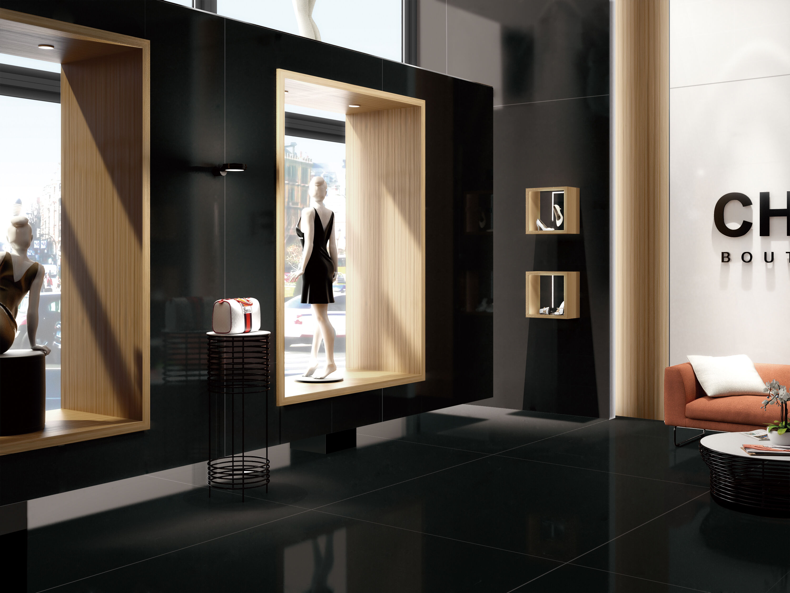
The relationship between wall and floor surfaces forms the foundation of any space's visual identity. When wall tiles complement flooring materials effectively, they create a unified environment that supports brand recognition and enhances user experience. This coordination becomes particularly crucial in commercial settings where consistent branding across multiple locations reinforces corporate identity and customer familiarity.
Understanding Color Harmony in Tile Coordination
Primary Color Relationships
Establishing effective color relationships between wall tiles and floor elements begins with understanding fundamental color theory principles. Complementary color schemes create dynamic contrast while maintaining visual balance, particularly effective when wall tiles feature cooler tones paired with warmer flooring materials. Analogous color relationships offer subtle sophistication through closely related hues that flow seamlessly from vertical to horizontal surfaces.
Monochromatic approaches using varying shades of the same color family provide timeless elegance and brand consistency. Wall tiles in lighter tones paired with deeper floor colors create spatial depth while maintaining color unity. This approach works particularly well in retail environments where product displays require neutral backdrops that don't compete for attention.
Neutral color palettes offer maximum flexibility for brand expression through accent elements and furnishings. When wall tiles incorporate subtle warm or cool undertones that echo floor materials, the result creates sophisticated environments suitable for professional settings. These neutral foundations allow for seasonal updates and brand evolution without requiring complete renovation.
Accent Color Integration
Strategic accent color placement through wall tiles can reinforce brand colors while maintaining overall design cohesion. Small percentages of brand-specific colors integrated into tile patterns create memorable spaces without overwhelming the senses. This technique proves particularly effective in hospitality and healthcare environments where brand recognition combines with calming aesthetics.
Gradient transitions between wall tiles and flooring materials offer sophisticated approaches to color integration. Subtle shifts in tone and saturation create visual movement while maintaining unified color stories. These transitions work exceptionally well in large commercial spaces where wayfinding and spatial definition enhance user navigation.
Texture and Pattern Coordination Strategies
Surface Texture Relationships
Coordinating textures between wall tiles and floor surfaces requires careful balance to avoid visual competition while maintaining tactile interest. Smooth wall tiles paired with textured flooring create pleasing contrast that defines surfaces without creating discord. This combination works particularly well in contemporary commercial environments where clean lines meet subtle material variation.
Matching texture intensities creates cohesive environments while allowing for material variety. When wall tiles feature subtle texture variations that echo floor material characteristics, spaces feel unified and intentionally designed. This approach supports brand consistency while providing visual interest through material diversity rather than pattern complexity.
High-contrast texture combinations require careful consideration of lighting and spatial scale. Rough-textured wall tiles can complement polished floor surfaces when proportions and applications support the overall design concept. These dramatic contrasts work effectively in statement areas where brand impact takes precedence over subtle coordination.
Pattern Scale and Rhythm
Pattern coordination between wall tiles and flooring elements involves understanding scale relationships and visual rhythm throughout spaces. Large-format wall tiles coordinate beautifully with small-scale floor patterns when proportional relationships create balanced compositions. This contrast in scale prevents pattern competition while maintaining visual interest across surfaces.
Rhythmic pattern repetition through coordinated tile layouts creates movement and flow between vertical and horizontal surfaces. When wall tiles incorporate geometric patterns that relate to floor tile arrangements, spaces develop cohesive design languages that support brand identity. These coordinated rhythms guide visual flow and enhance spatial navigation.
Avoiding pattern overload requires strategic restraint in tile selection and application. When floor patterns dominate spaces, wall tiles should provide calm backgrounds that support rather than compete. Conversely, dramatic wall tile patterns work best with neutral flooring that allows vertical surfaces to command attention while maintaining overall design balance.
Material Selection and Compatibility
Natural Material Combinations
Natural stone wall tiles coordinate exceptionally well with ceramic and porcelain flooring when material characteristics complement rather than match exactly. The organic variations in natural stone provide textural interest that pairs beautifully with consistent manufactured floor tiles. This combination creates sophisticated environments suitable for upscale retail and hospitality applications.
Wood-look wall tiles offer warmth and texture that coordinate effectively with stone, ceramic, or actual wood flooring materials. These combinations create residential comfort within commercial environments while maintaining durability and maintenance advantages. The key lies in selecting wood tones and grain patterns that enhance rather than compete with floor materials.
Metal accent integration through wall tiles creates contemporary aesthetics that coordinate with industrial flooring materials. Stainless steel, copper, or bronze wall tile accents complement concrete, terrazzo, or metal flooring systems in modern commercial environments. These material combinations support industrial and contemporary brand identities effectively.
Manufactured Material Coordination
Ceramic wall tiles offer unlimited coordination possibilities with various flooring materials through color, texture, and pattern matching capabilities. Advanced manufacturing techniques enable precise color coordination and pattern integration that supports specific brand requirements. These manufactured solutions provide consistency across multiple locations while maintaining design flexibility.
Porcelain wall tiles deliver durability and design versatility that coordinates with high-traffic flooring applications. Large-format porcelain wall tiles create seamless surfaces that complement polished concrete or stone flooring in contemporary commercial environments. The minimal grout lines achievable with large-format tiles support clean, modern aesthetics aligned with contemporary brand identities.
Spatial Considerations for Effective Coordination
Scale and Proportion Management
Room dimensions significantly influence wall tile and flooring coordination strategies. Large spaces accommodate bold contrasts and dramatic material combinations that would overwhelm smaller environments. Wall tiles in expansive commercial areas can feature larger formats and stronger patterns when coordinated thoughtfully with appropriate flooring scales.
Ceiling height affects the visual weight and proportion of wall tile selections relative to flooring materials. Higher ceilings allow for taller wall tile formats and more dramatic vertical emphasis, while standard ceiling heights benefit from horizontal emphasis and moderate tile scales. Understanding these relationships ensures coordinated selections enhance rather than compromise spatial proportions.
Traffic flow patterns influence material durability requirements and maintenance considerations for both wall tiles and flooring selections. High-traffic areas require coordination strategies that prioritize performance while maintaining aesthetic appeal. Strategic placement of accent wall tiles in lower-traffic areas allows for more delicate materials while maintaining design cohesion throughout spaces.
Lighting Impact on Coordination
Natural lighting conditions dramatically affect how wall tiles interact visually with flooring materials throughout daily cycles. North-facing spaces benefit from warmer wall tile selections that coordinate with flooring to create inviting environments. South-facing areas can accommodate cooler wall tile tones that balance intense natural lighting while maintaining coordination with floor elements.
Artificial lighting design must consider reflectivity and color temperature impacts on coordinated tile selections. Glossy wall tiles reflect artificial lighting differently than matte surfaces, affecting overall color perception and coordination success. LED lighting temperature selection influences how colors appear and coordinate between wall and floor surfaces throughout evening hours.
Brand Identity Integration Through Tile Coordination
Corporate Color Implementation
Incorporating corporate colors through coordinated wall tiles and flooring selections reinforces brand recognition while creating professional environments. Subtle integration of brand colors through accent wall tiles maintains sophisticated aesthetics while supporting marketing objectives. This approach works particularly well in office environments and retail showrooms where brand presence enhances business objectives.
Color psychology considerations influence how coordinated wall tiles and flooring contribute to brand messaging and customer experience. Warm color coordination creates welcoming environments suitable for hospitality and retail applications, while cool coordination supports professional and healthcare settings. Understanding these psychological impacts ensures tile coordination supports intended brand experiences.
Seasonal flexibility in coordinated tile selections allows for brand refresh opportunities without major renovation investments. Neutral wall tiles and flooring combinations provide foundations for seasonal accent updates through removable elements. This strategic approach maintains long-term coordination while allowing for brand evolution and market responsiveness.
Design Consistency Across Locations
Multi-location businesses require coordinated wall tiles and flooring specifications that maintain brand consistency while accommodating local conditions. Standardized material palettes ensure recognizable brand environments regardless of geographic location. These specifications must account for regional availability, climate considerations, and local building code requirements while maintaining design intent.
Franchise coordination requires detailed specifications for wall tiles and flooring combinations that support brand standards while allowing operational flexibility. Clear guidelines for acceptable variations ensure consistency while accommodating budget and timeline constraints. These standards protect brand integrity while supporting franchisee success through practical implementation approaches.
Maintenance and Longevity Considerations
Cleaning and Care Coordination
Coordinated maintenance requirements for wall tiles and flooring materials ensure long-term aesthetic success and cost efficiency. Selecting materials with compatible cleaning requirements reduces operational complexity and maintenance costs. Wall tiles requiring similar cleaning products and techniques as flooring materials streamline facility management while maintaining coordinated appearances.
Stain resistance coordination between wall tiles and flooring prevents mismatched aging and appearance degradation over time. Materials with similar performance characteristics maintain coordinated aesthetics throughout their service lives. This consideration proves particularly important in food service and healthcare environments where cleanliness requirements demand frequent cleaning protocols.
Replacement planning for coordinated wall tiles and flooring ensures future renovation maintains design intent and brand consistency. Selecting materials from manufacturers with consistent product lines and color matching capabilities supports long-term coordination success. This forward-thinking approach protects design investments while facilitating efficient maintenance and updates.
Performance Coordination
Durability matching between wall tiles and flooring materials ensures coordinated aging and appearance retention over time. Materials with similar performance characteristics maintain aesthetic relationships throughout their service lives. This coordination prevents situations where one surface shows wear significantly faster than coordinated elements.
Thermal expansion coordination prevents structural stress and appearance problems in coordinated tile installations. Wall tiles and flooring materials with compatible expansion characteristics reduce maintenance requirements and preserve coordinated aesthetics. These technical considerations ensure long-term success in coordinated design implementations.
FAQ
What factors should be prioritized when selecting wall tiles to coordinate with existing flooring
When coordinating wall tiles with existing flooring, prioritize color harmony by identifying undertones in your floor materials and selecting wall tiles that complement rather than match exactly. Consider the scale and texture relationships to avoid visual competition between surfaces. Lighting conditions significantly impact color perception, so evaluate samples under both natural and artificial lighting conditions where the tiles will be installed. Additionally, assess maintenance requirements to ensure both materials have compatible cleaning needs for long-term aesthetic success.
How can businesses maintain brand consistency across multiple locations through coordinated tile selections
Businesses achieve consistent brand identity through standardized material specifications that account for regional availability and local building requirements. Develop comprehensive design guidelines that specify acceptable wall tiles and flooring combinations while allowing controlled variations for budget or availability constraints. Partner with manufacturers who maintain consistent product lines and color matching capabilities across distribution networks. Create detailed installation standards that ensure proper coordination techniques are followed regardless of contractor or location.
What are common mistakes to avoid when coordinating wall tiles with floor elements
Avoid exact color matching, which often appears artificial and limits design flexibility over time. Don't ignore scale relationships - using similarly sized patterns on both walls and floors creates visual chaos. Overlooking lighting conditions leads to coordination failures as colors appear different under various lighting scenarios. Failing to consider maintenance requirements results in mismatched aging and appearance degradation. Additionally, avoid trendy combinations that may quickly become dated, especially in commercial applications where longevity supports return on investment.
How do texture combinations between wall tiles and flooring impact overall space perception
Texture combinations significantly influence spatial perception and user experience within coordinated environments. Smooth wall tiles paired with textured flooring create visual separation that can make spaces feel larger and more organized. High-contrast texture combinations add visual interest and tactile richness but require careful balance to avoid overwhelming smaller spaces. Matching texture intensities create cohesive, calming environments suitable for professional and healthcare settings. The key lies in understanding how different texture combinations support intended spatial functions and brand experiences while maintaining practical performance requirements.
Table of Contents
- Understanding Color Harmony in Tile Coordination
- Texture and Pattern Coordination Strategies
- Material Selection and Compatibility
- Spatial Considerations for Effective Coordination
- Brand Identity Integration Through Tile Coordination
- Maintenance and Longevity Considerations
-
FAQ
- What factors should be prioritized when selecting wall tiles to coordinate with existing flooring
- How can businesses maintain brand consistency across multiple locations through coordinated tile selections
- What are common mistakes to avoid when coordinating wall tiles with floor elements
- How do texture combinations between wall tiles and flooring impact overall space perception